Project Background
Kari Lynn approached me about re-doing her outdated website. She admitted that the current site was a free one that she herself had put together. She knew her existing site wasn't professional enough and rarely used it to market her business. She mainly used it to refer potential customers to her service menu and pricing structure. We met and determined what the main goals of the site were the following: a site that is easy to navigate (many of her clients were older), attractive and modern, male it simple for people to book appointments online, and easy to find services and pricing. Additionally, having an online booking system, which she did not have on the old site, would cut down on missed appointments (and therefore missed revenue), another ongoing problem for her.
Task And Mission
Re-design Skin by Kari Lynn into a responsive website that is easy to use.
Give her clients an easy and inviting way in which to book appointments online while still having
contact information visible for those who would rather call.Improve the overall flow of the site.
Design a logo and a clean, fun, modern brand that embodies Kari's personality and what she does.
Create a site that she can proudly showcase and use as a viable marketing tool.
DISCOVERYResearch Goals
Find out how people prefer to schedule appointments and why.
What motivates people to go to a spa website.
What kind of environment do people expect to find in a spa.
What kind of information people look for on a spa website
What the primary reason is for going to a spa website.
Find out more about the industry and industry trends.
What are some of the pain points people experience on spa websites.
Interviews
Participants
Gender
- A total of four women were interviewed.Race
- Two Caucasians
- One Asian
- One Pacific IslanderAge
- Two @ 28 years old (Millennial)
- One @ 44 years old (Gen X)
- One @ 62 years old (Baby Boomer)Employment
- Two employed full-time
- One part-time
- One semi-retiredMarital Status
- Two married
- Two singleIncome
- Three upper/middle income
- One < $10,000Education
- Three Bachelor's or higher
- One AssociatesLocation
- Three in Arizona
- One in California
Summary
All had some experience with online booking.
Half those interviewed preferred the phone over online booking
New customers prefer calling to schedule
Established clients prefer to book online
Found descriptions of spa services difficult to understand
Fewer buzzwords in the service descriptions
Ratings weigh heavily in decision to use a spa
Discounts or specials are motivation to go to a particular spa
Customers like seeing photos of spa interior
DEFINE
Personas
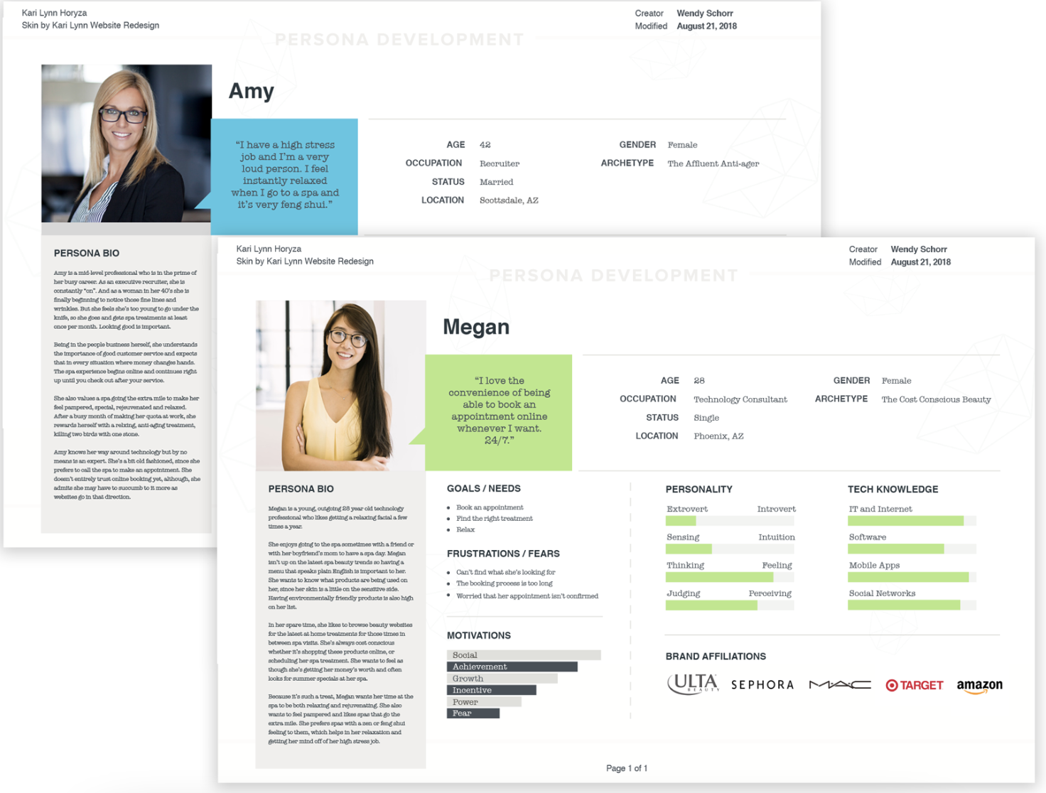
For this project, I developed two personas: A primary, Megan, and a secondary I named Amy. Each has different needs and goals. Megan is a young, cost conscious Millennial who prefers booking online and views going to the spa as a treat since she can't do it often. Amy, on the other hand, is an older woman who is beginning to engage in anti-aging activities and sees the spa as a necessity. Her needs are different. She is not quite as trusting when it comes to technology. These two personas were borne out of the research done in the previous phase. View Megan's persona. View Amy's persona.
Task Flow
Performing the task analysis allowed me to easily walk through the flow to identify the key screens necessary to understand how Kari's users would go through the main task of booking an appointment online. Some key things we strive to understand: How they arrived at the site (for example, entering from Facebook or Yelp), where they go as they move through the site, and finally the end of the process where they get the email confirmation. Understanding this flow is vital to the creation of the site and helps us set up the user flow.
User Flow
Based on the previous task flow and what we know about their habits, this user flow walks through both Megan and Amy's journey through the site, taking into account various decision points along the way.
Site Mapping
Redesigning an existing website gives us the "advantage" of having an information architecture (IA) already in place. The client and I discussed the structure of the site ahead of time. I had every intention of speaking with her clients about the use of the site to get more insight into the architecture, but she was reluctant to give out their information to me. If I had had that research and also usage statistics, information architecture might have turned out differently. However, it was the client's wishes to keep the IA largely the same as the old site. I did not have any data to convince her otherwise. The main difference between old and new site is the addition of the Appointments page.
Here is the resulting site map.
Sketches
After showing the client some competitor's websites, and nailing down the site architecture, we had a feel for how the site should look. We wanted to keep it very loose and flowing and not get distracted with a lot of detail. This exercise allowed me to start thinking about where content would fall on the page. Here, you see the homepage and its potential layout. Using sketches allows for quick iteration and the generation of ideas very quickly. View the full sketches.
DESIGN
Responsive Wireframes
After reviewing the sketches with the client and a couple of iterations, it’s time to start refining in the form of a low fidelity wireframe. Here, I further identified the layout of the interface. Utilizing wireframes in the beginning phases of design, is an efficient way to communicate placement of elements without getting too bogged down in minute details. A huge benefit and timesaver is that the layout can easily be changed. View the full responsive wireframes.
Mood Board
For Kari's moodboard I used some of the feedback gathered during the interview stage. The interviewees were asked about color and ambiance. Water came up a lot in those interviews. People mentioned blues and greens most often because of their calming effects.
View the full mood board.
Branding
Logo Design
The logo is the flagship of branding. This process began with coming up with words that embodied what the company was about, followed by rough sketches, and finally into the version seen here.
Style Tile
This is where Kari's branding really starts to take shape. By using the moodboard elements as inspiration we came up with the resulting style tile you see here. The client was presented with a choice of color palettes and she chose the one pictured. This gives us an idea of how the site could look by listing out all the different variations in logo styles, colors, and photo usage. The style tile helps set the mood and tone of the brand and is used in the next step. View the full size style tile.
High Fidelity Responsive Design
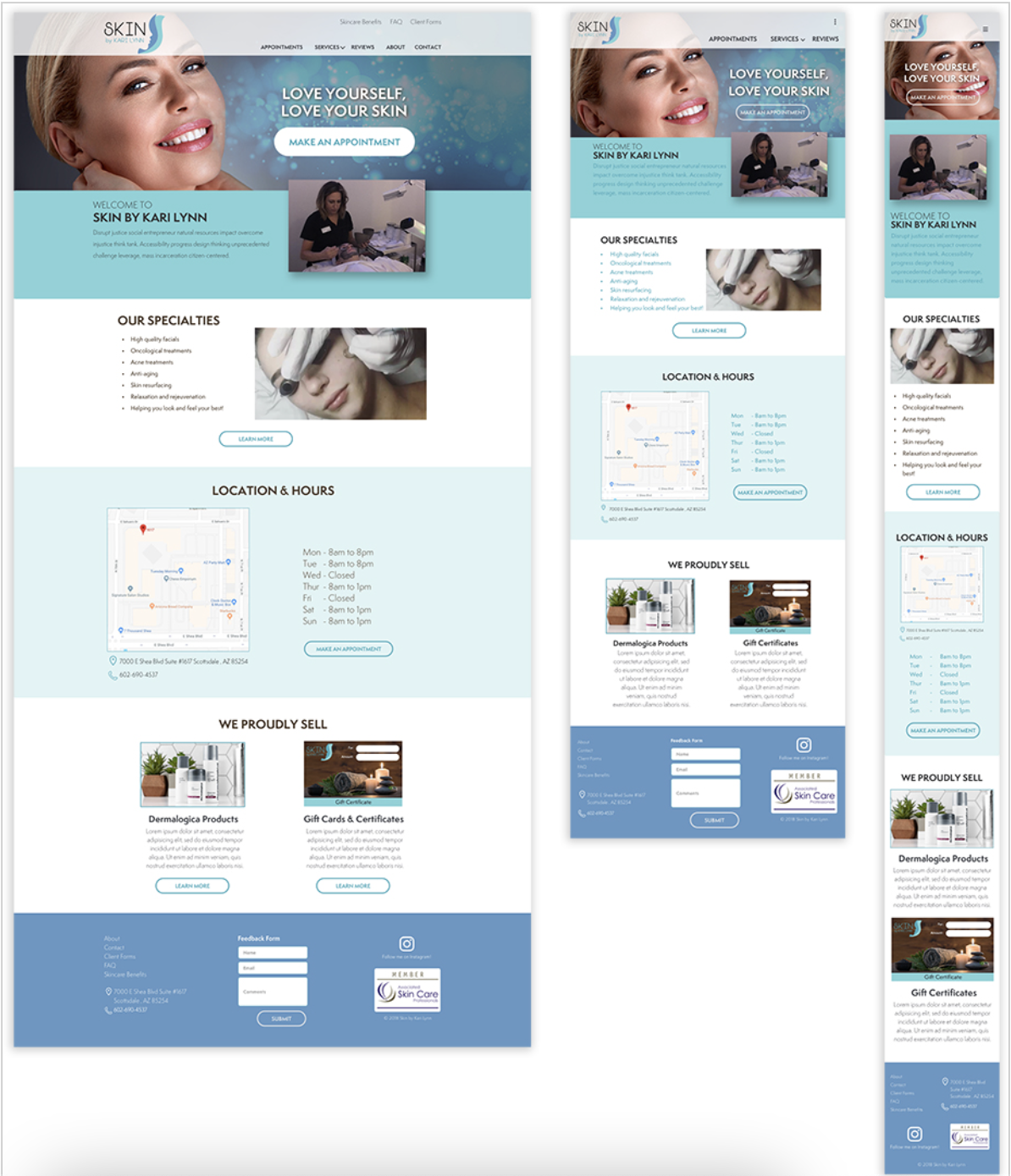
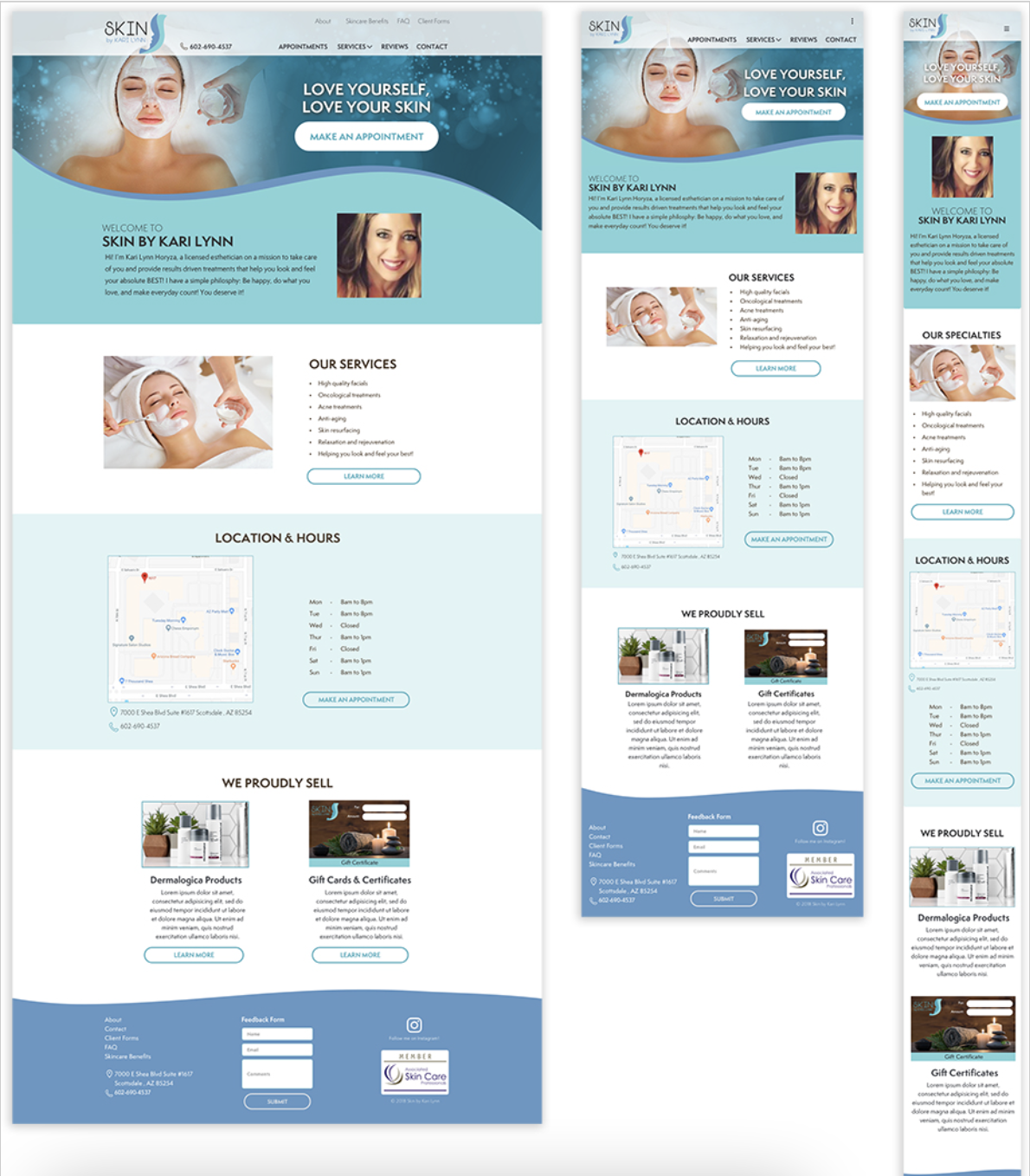
In this step, I did a more polished, high fidelity version of the low fidelity responsive design mockups done earlier. It’s the same concept, except I applied the aesthetics from the style tile. This version contains all of the fonts, buttons, components from the style tile.
View the full size high fidelity responsive design.
High Fidelity Prototype
The high fidelity prototype is created in preparation for usability testing. In this step, we define what we want to test and why. In this case, it will be our main task flow of booking a service using the online booking feature. We develop a test plan and develop the flow inside of our prototype using a tool called Invision. Interact with the prototype.
Usability Testing
Participants
24 total test subjects
- 3 in person (All female)
- 21 remote, unmoderated
Test Objectives
Determine the ease at which users can navigate through the website to accomplish their task, which will be to book a particular service.
Observe how users searched for and found the service.
Observe which method the user used to book their appointment (There is more than one way to book.)
Test the overall ease of use of navigating the website.
Observe any frustrations or obstacles users may have that may impede their ability to complete their task.
Test Summary
In Person Testing
- Users had very little trouble completing the task asked of them.
- Difficulty in reading some text
- Minor concern over photos subject matter
- HIgh praise for color palette/brandUnmoderated Remote Testing
- 33% had no trouble completing the task.
- 14.3% used an alternate route
- 52% gave up
- Frustration over having to scroll on the menu of services page
Affinity Map
An affinity map is created from the findings during the usability testing. The map helps sort, prioritize, and rank user feedback. From those results we are able to see patterns and from those we are able to come up with refinements to implement in the design.
Priority Revisions
From the affinity map exercise we determine which revisions we want to make to the prototype. We begin by prioritizing which ones have the lowest amount of effort but the highest rate of return. The changes in this case were relatively minor and so nearly all of the changes that users suggested were implemented.
Next Steps
Kari Lynn is a real client. All of the necessary pages will be mocked-up and subsequently implemented before the end of 2019. We will come up with some KPIs so that we can monitor site usage during the year and see if whether or not we were successful in our endeavor to make this into a viable marketing tool where Kari Lynn can gain new business.


