EVENT ORGANIZERS have traditionally used Universe because of its reliability in setting up events quickly and selling tickets.
_____________________________________________________________________________________________
But what happens as soon as an event has launched or concluded? How can we help event organizers track their success and optimize for their next event?
______________________________________________________________________________________________
Universe’s dashboard is a feature that’s frequently seen by users as it is the first page one would land upon when they login. However, our data shows that majority of our users spend very little time on this page as we suspect it did little to add value to their experience.
Talking to Customers
After seeing that we had nearly twice as many visits per month from Event Organizers than Attendees, we determined that our target user would be the Event Organizer.
In order to understand this persona a bit more, we spoke to our own customers hosting events that varied in size, frequency and type. By doing this, we could also capture how they were using our current dashboard and what value they took from it. We learned that such an organizer that hosted multiple events included reoccurring classes/workshops, attractions and venue-based events.
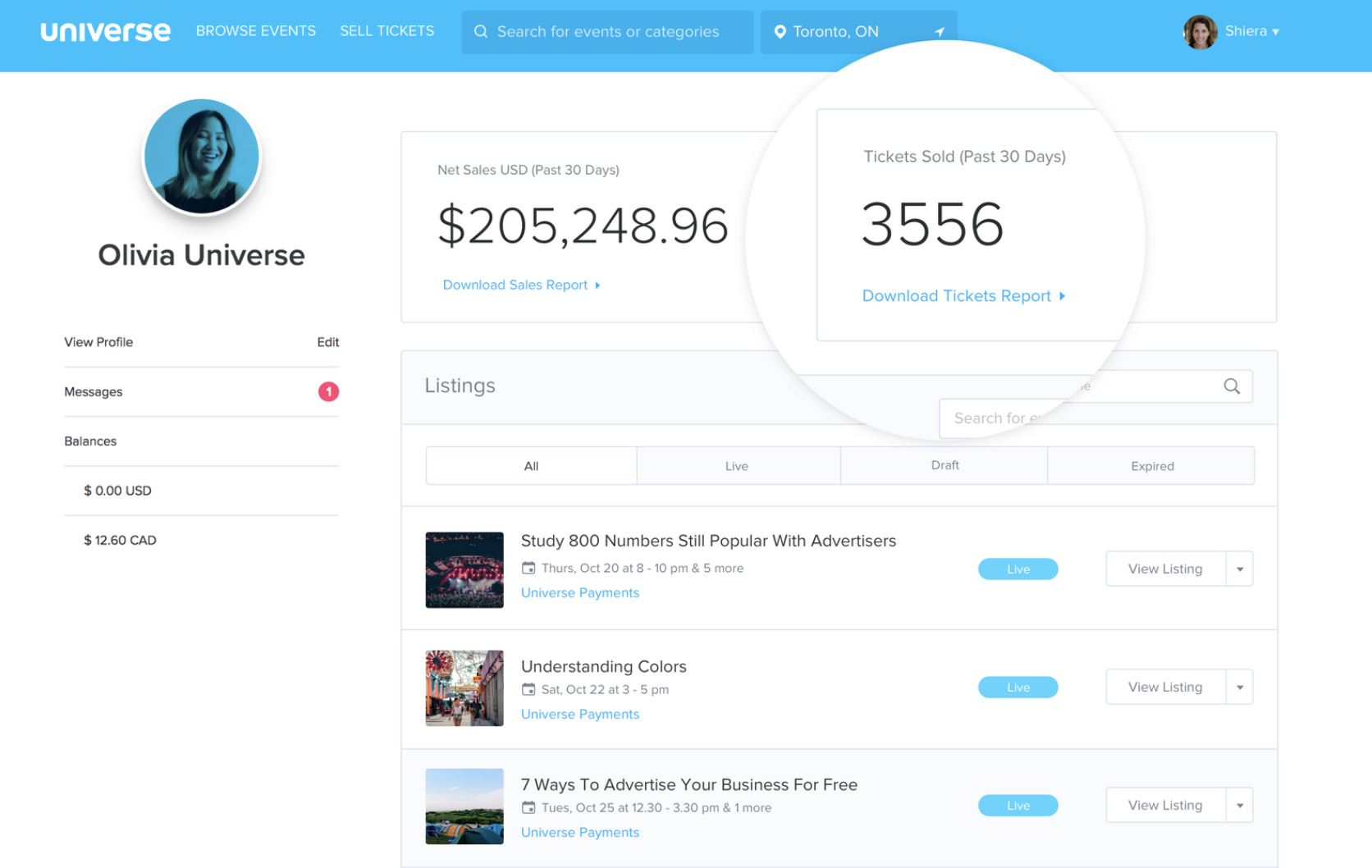
Some of their major pain points came from the missed focus of the dashboard. It was also simultaneously catering to Attendees. For example, Attendees would also navigate to this page to access their tickets while Event Organizers would use this page as an index of their events.
I noticed the dashboard also lacked global-level data for all of an organizer’s events and that there were functionalities that didn’t quite belong. Visually, there was also a lack of hierarchy and priority in the way information was presented.
I also looked at other dashboards of popular platforms to further my research on what a useful dashboard is comprised of. Some takeaways of what made them successful included:
Well structured navigation
Informative data that is actionable
Data presented in filterable timelines
Insights shown at different milestones
Main ObjectiveThis feature was important for us to improve in order to relieve pain points that Event Organizers encounter, especially around their journey of when an event goes on sale to preparing for their next event.
We determined that our main objective is to increase daily activity and mobile activity from Event Organizers. A large portion of our users are found to be using mobile to login to their accounts.Starting with Questions...
We created a list of ‘How Might We…’ questions to help us better align our user’s tasks and goals:
How might we provide an experience that is engaging and valuable to our users?
How might we allow them to access their most critical event information through their mobile devices?
How might we provide a tailored experience that allows organizers to see what’s most important to them?
The Redesign Process
Card Sorting
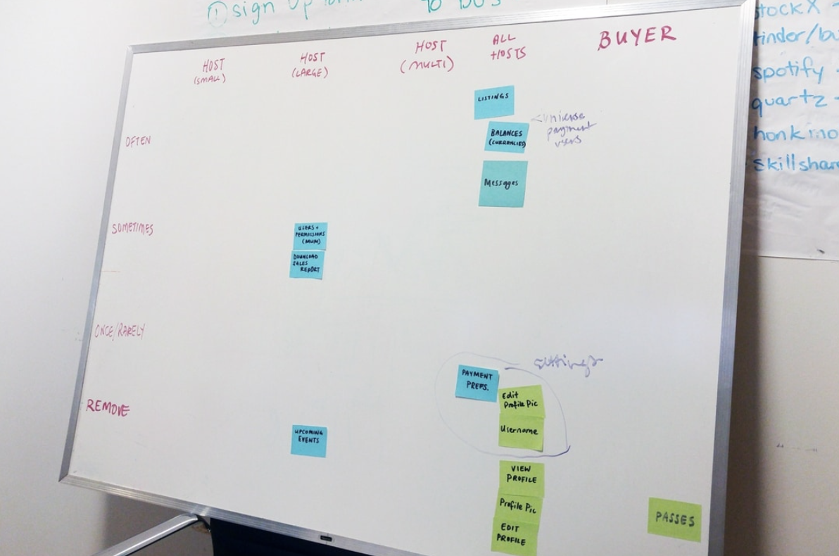
I ran a card sorting session that was composed of members from our Sales and Support teams. I used this technique to determine which functionalities of the dashboard should stay, be relocated or be eliminated based on our platform’s information architecture and how much value it was adding on our dashboard.
Internal Feedback
I sent out a survey to our client-facing teammates to quickly inquire what should be added or removed from our dashboard. The purpose of this was to discover potential quick wins on simple improvements that could be executed quickly.
[We need] more account level reporting. More account level changes i.e. adding referral codes. Ability to see info on certain events at-a-glance i.e. tickets sold/remaining per event. — Response from an internal survey
Some of the feedback we got back was:
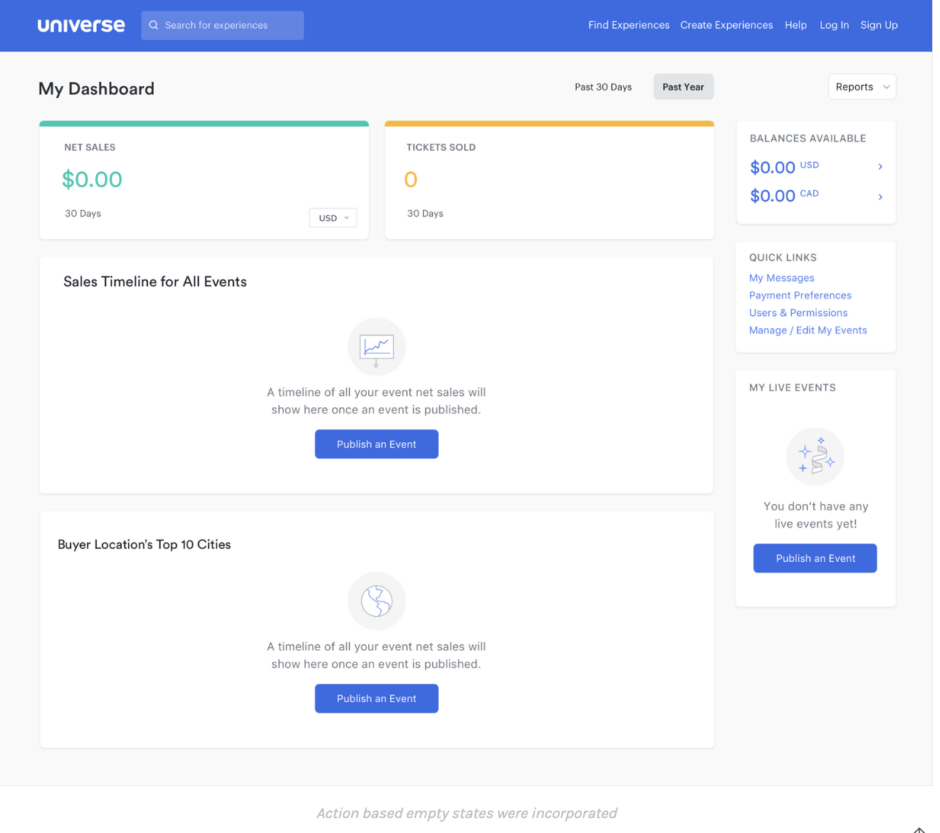
When an Event Organizer has no funds to withdraw, we should not show their Balances. It was not ideal to show empty data to our users.
A big feature request was the ability to export a report of global-level sales as well as their overall revenue.
The MVP
To validate these findings, I designed a simple overview of the user’s net sales and tickets sold, the option to export reports for these data points and removed a couple of features discussed in our ‘Card Sorting’ session.
After soft-launching to a smaller set of actual users, we started to see a difference immediately. Our clients expressed the usefulness of these additions but more importantly, we saw a decrease in the amount of drop offs on the dashboard.
Iterate, Iterate and Iterate
Based on our all of our findings shown above, we narrowed our focus into 4 areas for potential improvement of our original dashboard:
Improve the data we provide
Improve navigation
Improve actionability
Improve notification
Improve the data we provide
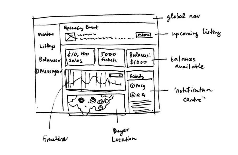
I learned that a majority of our clients want more details on how much they’re selling each day, where their buyers are located and a way to compare their multiple ongoing events. I wanted to display the data in a more visual way for it to be better digested and appealing. Keeping in mind of technical constraints, I made sure we were using charts and graphs from an existing library.
Improve navigation
We included a sidebar of quick links that organizers frequently visited, and still kept an index of their upcoming events.
Improve actionability
What can Event Organizers do once their event is over? What happens when there are no upcoming events? We thought of a few ways to help guide and enhance the experience by prompting tips during different states of an event’s period, especially when a dashboard is empty.
Improve notification
How can we inform our users they’ve sold tickets today? How we notify them that they received a new message from a buyer? We worked on improving communication that would inform the user of activity milestones for their event.
Next Steps
The released version of the dashboard has been well received by our customers. However, there are still improvements that can be made. An event organizer should be able to filter their data even more, and customize the view based on their needs.
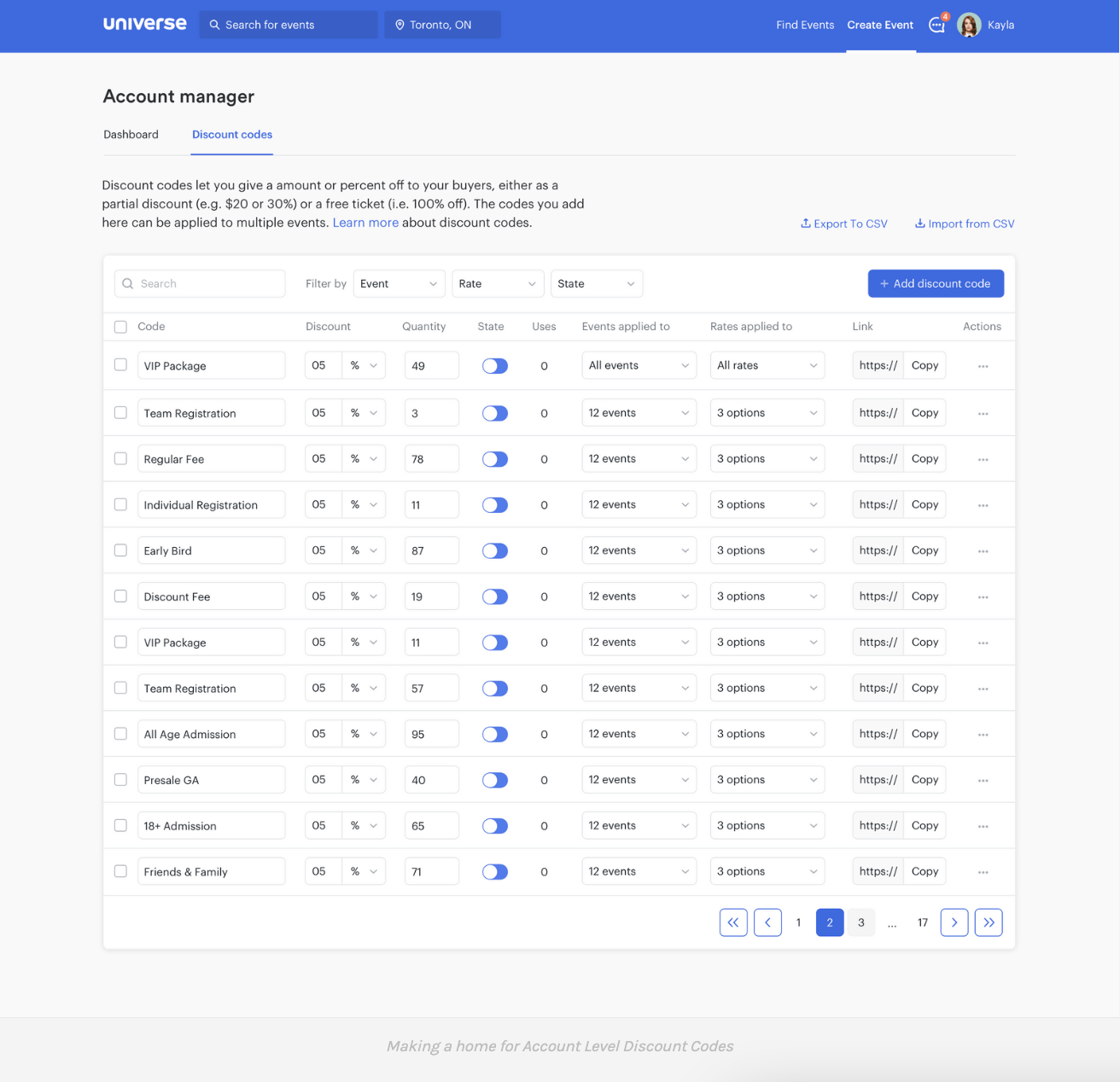
We helped revised a foundation that allowed us to build on top of, adding in a home for global level features and functionality such as Account Level Discount Codes. The patterns and designs created would later help inform future parts of the product as we constantly strive to improve our Event Organizers’ experience.


